
Pantone Color of the Year
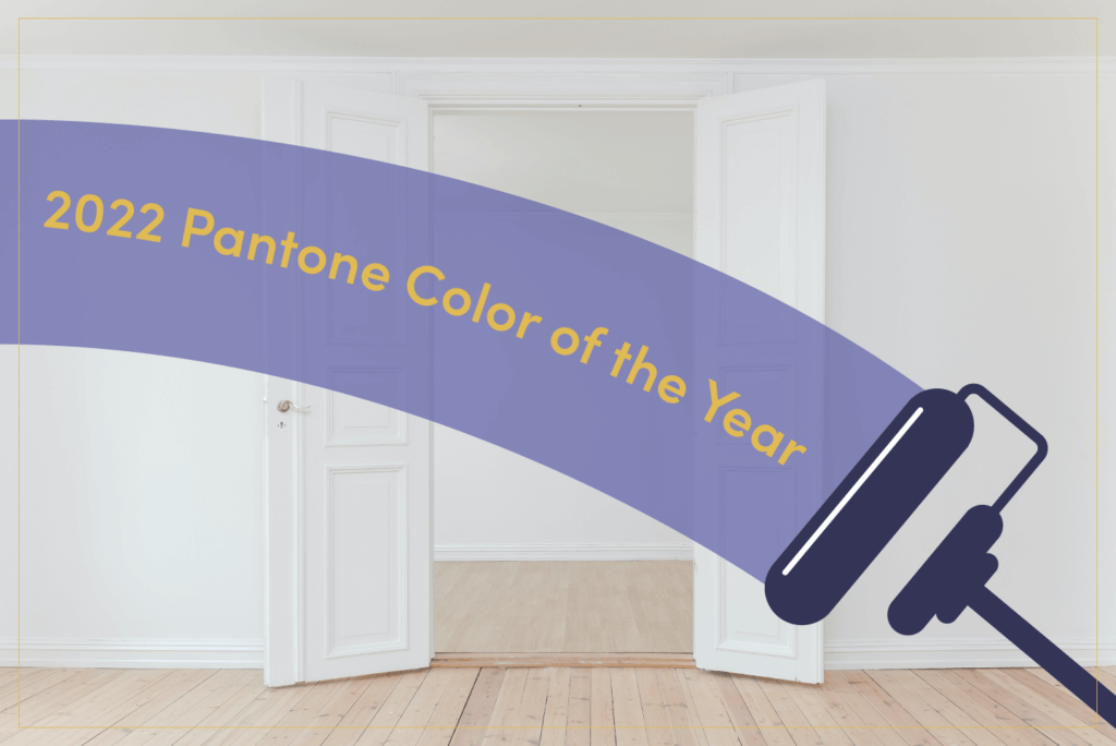
For the arts and design industries, every new year brings a new Pantone Color of the Year that sparks conversations, influences design choices, and sets the tone for the new year. This year is no different, with Pantone releasing its 2022 Color of the Year at the beginning of January.
The color is called Very Peri (PANTONE 17-3938) and, true to its name, it is as periwinkle as purple can be! At once soft and bright, this color was created by Pantone specifically to be the new color of the year. As the Vice President of the Pantone Color Institute said about this decision, “The Pantone Color of the Year reflects what is taking place in our global culture, expressing what people are looking for that color can hope to answer. Creating a new color for the first time in the history of our Pantone Color of the Year educational color program reflects the global innovation and transformation taking place. As society continues to recognize color as a critical form of communication, and a way to express and affect ideas and emotions and engage and connect, the complexity of this new red violet infused blue hue highlights the expansive possibilities that lay before us”.
With this brand new color set as 2022’s Pantone color, it’s time to let those creative ideas flow and consider when to incorporate this modern, unique color into interior design.
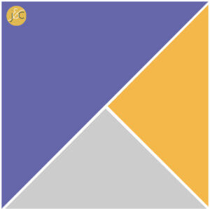
Pair it with other colors. Before adding Very Peri to your walls or furniture, consider what other colors will make the room pop. Purple’s complement color, yellow, is an excellent choice. Gray and white will also let Very Peri shine through. Blues and greens, on the other hand, may be more tricky to match, but can create a rich, jeweled palette.
Don’t be boxed in with interiors. Consider using Very Peri as a splash of color for a front door or window boxes. Tie in the color with a matching mailbox or even some purple crocuses in the spring!
Use it for its potential soothing effect. Looking for a bit of calm within your home? Color therapy links purple with relaxation and reducing stress. It is also the color used to represent the Crown Chakra, making it an excellent color for a yoga or meditation space.
Pick one of the unlimited accent options. Accent your interior by picking out new curtains, cushions, throws, or accent chairs in Very Peri. Just small, subtle changes can be enough to create a contemporary, new environment in your home.
Paint a wall. Or two! Very Peri is an excellent shade for an accent wall in your home. While painting every wall might feel overwhelming in one color, strategically choosing one or two walls to add a splash of color makes the job quick and simple while looking elegant.
With so many options, we are sure to see many designers and homeowners decorating with this periwinkle shade! What ways will you find to incorporate the shade into your palette over this year?
About the Author
By: Rachel Valerio
Exclusive for JulieCoRealty.com